Q2-43 : THRILLER PROJECT 2007/8

Friday, 14 March 2008
Q2-43 : THRILLER PROJECT 2007/8

Effects 2

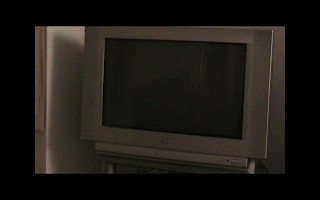
To create more suspence, we decided to have the shadow of the suspected murderer to be shown in the tv screen. At this point, the audience should be really focusing on the screen so that they can try to see the murderer.

Labels:

Shots

This shot was taken on top of Millets in Cambridge, and we edited it on final cut using 'noise' in order to get the effect of a CCTV camera-also implying someone being spied on. The Date and time makes it look even more realistic and adds to the suspension of what is happening?!

Labels:

Oli took this ariel shot in order to make it seem like someone is being spied on. It wasn't planned for this man to be walking, but i was just waiting for someone to walk through so i could film them. The natural light was really effective as it is like sepia filter used on final cut.

Labels:

Effects

On this shot, we decided to make it look like a news report by editing the writing scrolled across the bottom. The words are "BODY OF CAMBRIDGESHIRE GIRL FOUND" this scrolls across the screen, just like in a real news report. We looked at real life news reports in order to make it as precise as possible.

Labels:

Thriller - Final

Labels:

Tuesday, 11 March 2008
Q2-43 : THRILLER PROJECT 2007/8

Feedback

Can you describe what happens in our thriller?
  • a girl is found dead
  • a believed murder, odd person creepy around murderer?
  • girl murdered then we can see possible suspect
  • someone died
  • someones been murdered and not found the killer

What would you add to make it longer?

  • we think its long enough
  • it doesn't need to be longer
  • ditto!!
  • its fine..but if you really wanted to Izzi says you could add some more features
  • more newspaper clippings (not essential though)

What do you think works best in our thriller?

  • effects such as the graininess and also the music > builds suspense
  • the double images overlay is used to good effect
  • music and has very good interesting shots
  • all the police bits and newspaper
  • the shots of the murderer scene and the news clippings
  • 8/10 for all maybe 9

Do you like of dislike the music and why

  • like it because it has a good beat, makes it more mysterious
  • the music is good. Goes well with the shots, adds mystery
  • the music makes it a thriller, works very well
  • its really good - works well for the genre and helps the tension
  • music was groovy!

Labels:

Monday, 10 March 2008
Q2-43 : THRILLER PROJECT 2007/8

Problems with the soundtrack

Towards the end of are editing to are final version, we also started to look at are soundtrack to make sure it fitted in with the final version by making sure it was the same length and by making sure it fitted in how we wanted it to. However, Mara had a look at it and thought that it didn't really fit in with the sequence so tried out other things, but in the end we changed it back to the original version as we were running out of time! Also we had to make sure the soundtrack finished a couple of seconds before the end as we had to make room for the tv noise at the end.

Labels:

Update

Since the animatics, we have changed the order of shots, titles, and have added new shots to our sequence. For example, in our animatics the first shot was the alley way shot with the Tangerine Productions in but now that and is 2nd shot, however with the tangerine productions in the shot on the high building overlooking Cambridge, which was what Oli shot when he took the camera to his work and done some extra filming.
In our blog we made a list of the titles we were going to use and used in the animatics, but in the final we've changed names, the order of the titles e.g. actors/actresses at the start and changed over what shots we put the titles in e.g. Tangerine Productions over the high building.
Shots which we used in are animatics are all pretty much the same as the final version but just in a different order etc but we've also added in extra shots to make it longer and more effective e.g. the newspaper clips, knife, fireplace, on top of high buildings etc.

Labels:

Props


Knife: This was a new idea we thought of using whilst we were filming. We got it from Maras house and filmed it there.
Tape:Oli got this from his dads work which we used whilst filming at college for the murder scene.
TV:We used Maras tv because we were filming at her house.
Newspaper cuttings:Found some on the internet then printed them out and filmed them/took pictures of them using the webcam on the computers.


Labels:

Filming Review

Positive things that went well during filming:
  • We did all the footage which we planned in lessons.
  • Filmed extra footage whilst we were in Milton as we came up with new ideas on the spot.
  • Got all the shots filmed which were on the shot list.
  • Footage fits quite well with the music sequence.
  • We all kept civilised and there was no arguing.

Negative things:

  • Got dark quickly as the bus took ages!
  • Too much light when we were filming the tv part - had to make sure the reflection of the camera didn't come up on the tv screen.
  • Under a time limit, as some people in our group needed to be somewhere by a certain time.

Labels:

Friday, 29 February 2008
Q2-43 : THRILLER PROJECT 2007/8

Shoot

Our group went to Milton to film around Milton and to film at Maras house as we needed different props such as a knife and we needed to film through a kitchen window for part of are sequence. During filming, we obviously shot what was in our storyboard but throughout it we thought of new ideas and places where we could film which would look quite mysterious. When we finished shooting in Milton, Oli took the camera himself and filmed the rest at his work Millets, then once we got back to college, during media lesson we had to film abit more to finish it. I played the part of the dead body at the murder scene. Oli brought in tape which we used to make it look like a murder scene on the news report.

Labels:

Tuesday, 26 February 2008
Q2-43 : THRILLER PROJECT 2007/8

Feedback on 'Rough cut'

Q2-45

this group agreed that the sequence was clear and was easy to understand, this is a positive point as it means that the audience will understand what is happening.
This group also thinks there is a number of unanswered questions, for example it is not clear who the killer is, this is also a positive point as we chose for that to happen and we didn't want to give too much away.

Q2-47

Our opening sequence reminds this group of the opening sequence to the film 'seven' as the text appears similar, i think that this is a negative point as we do not want to appear as if we have copied another group, this is an aspect in which we could possibly modify.

Q2-44

This group thought that our opening sequence was quite disturbing and dark, this is not necessarily a bad point as this is what we were trying to put across. This group also like the images we used from newspapers, this is also a positive point.

Q2-46

This group agreed that we made good use of props/settings and put the different characters across as we intended, for example we showed the victim in the kitchen to be innocent.

Labels:

Feedback

Other members of our class gave us this feedback to out rough cut...
MOOD/ATMOSPHERE? spooky, crime scene
OTHER FILMS IT RELATES TO? the film 'seven' in the way the newspaper text appears
WHAT HAPPENS IN THE OPENING? person is stalking..someone has been murdered, or about to get murdered
WHO ARE THE CHARACTERS? girl in the kitchen, man with hood, dead person.
WHAT QUESTIONS DO I STILL HAVE? who is the stalker an why were they killed?
GOOD EXAMPLES OF PROPS/SETTINGS? good settings, roof tops, newspaper, im[plies murder...cant see the whole story, adds mystery...dark figure? mysterious/dangerous?
PERFORMANCE? innocent victim...adds suspense..
AREAS OF IMPROVEMENT? soundtrack needs to be added...and lengths of shots need to be edited. and put into order.
VISUAL STYLE OF SEQUENCE? dark images, quite disturbing.
EXAMPLE OF EDITING/LIGHTING? flash of images, filmed at night, eerie and effective.
MOST STRIKING IMAGE? boy walking accros road, sunset, mysterious, want to know where and why he's there...

Labels:

Rough Cut

Labels:

Tuesday, 19 February 2008
Q2-43 : THRILLER PROJECT 2007/8

Face off opening


This title sequence is very effective and it uses various different effective techniques. At the very beginning of the sequence music is soft and light hearted but the music soon changes to a more dramatic genre to reflect the series of events in the sequence. Text comes up on the screen on various occasions to show the names of the actors and writers, the text appears and disappears slowly t reflect the steady series of events in the title sequence.
The opening title sequence gives a very good idea to the audience about the film, just from the opening titles you can tell that the film is an action/thriller aimed at men between the ages of around 14 and above, the sequence really sets the scene for the whole film.

Labels:

Monday, 4 February 2008
Q2-43 : THRILLER PROJECT 2007/8

News reporter on scene


This is an example of the sort of thing we will be doing e.g. having a reporter on the scene. We will have a reporter on the scene commenting of the murders. Just like in this video.

Labels:

Example of news room


This is an example of a news studio. One of our ideas to recreate a news room or have a news reporter. this clip gives an idea of how the reporters talk to the camera and each other.

Labels:

Shot List

1st shot = shot of streets for Tangerine Production
2nd shot = then it fades into the news report
3rd shot = spying on someone in an office
4th shot = shot of stairs with no one on them which is in Millets in Cambridge
5th shot = flicks of the newspaper which comes in and out with quick clips of articles in the paper (fuzzy)
6th shot = a shot of the murderer spying on a woman through the kitchen window whilst shes doing the washing up. this will be at Oli's house
7th shot = shot of a set of knives on a table which are the murder weapons. this will be at Oli's house.
8th shot = another shot of the news report, reporting there has been another murder.
9th shot = then it goes onto the shot of the murder scene.
10th shot = then fades onto the shot of the close up of a tv, which on the tv is the news report.
11th shot = the shot of the tv but has zoomed out so you can see the whole tv and the room and then you see the silluet of the murderer on the tv screen just sitting there watching the news report of his own victims.
12th shot = lastly the title of the thriller appears then it will fade onto the start of the film which isn't on the animatics. iSPY

Labels:

Feedback on are animatics

People in the class thought that we need to make our soundtrack longer as it's not complete yet, also when we come to doing the final shots, we need to change the order of the titles. For example, Tangerine Productions - Edited By.. - Directed By.. - then go on to the Actors/Actresses because at the moment its not really in order. In the final shots we need to make some of the shots fuzzy and so they're flicking on and off which we haven't done in the animatics.

Labels:

Friday, 1 February 2008
Q2-43 : THRILLER PROJECT 2007/8

our animatics video

Labels:

Tuesday, 29 January 2008
Q2-43 : THRILLER PROJECT 2007/8

Location Shots


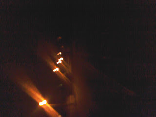
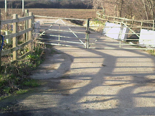
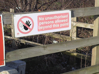
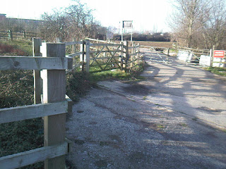
These images were taken in order to get an idea of what type of shots we need. As the genre is thriller, the shots need to be very creepy and have a sense of curiosity to them. The pictures taken in the dark with little lights is simply a street at night. We were thinking of having the fist title of 'A Tangerine Productions' in the eerie distorted lights to create effect of the thriller genre. The warning signs would be quite effective if we distorted them and have them flash in and out of our footage. We need to find more creepy places to shoot in, one of them being at Millets in Cambridge where Oli works, as it is quite spooky leading up the stairs and onto the roof.

Labels:

Friday, 25 January 2008
Q2-43 : THRILLER PROJECT 2007/8

pitch

Title of film - i spy

Props:
Hazzard tape - oli
newspaper cuttings - Mara
Knife/tools - shots to be taken off site as it is illegal to bring in college.
Clothing - Trench coat (for murderer)
Hats (large) Cowboyish
Television - on location.


Locations-
Rooftop of millets in Cambridge - for long shot of the general people. Oli can do this as he works there and has permission.
Living room of house - Mara's house also has a tv for the final shot.
Stair case at millets cambridge - Old fire esacpe also oli having persmisson
Office - Maras dad gave us permission to shoot at his office.
Olis mum has given us permission also to shoot through her kitchen window.

Characters -

Murderer - Will only appear in siluete form to add mystery. So adam will be playing the murderer ashe is the tallist which will make him seem mre intimidating.

People in office - Maras dad colleueges

Kithchen - olis mum

People walking in cambridge - general public

Titles -

A Tangerine production

Directed by Oliver Darke

Starring Adam Richards

Oliver Darke

Hollie Seymour

Mara Chowdhury

I SPY

Feedback:
Someone made a comment that our title "I Spy" has already been used

Monday, 21 January 2008
Q2-43 : THRILLER PROJECT 2007/8

Mara's Thoughts

In the Kids TV we didn't get an organized shot list, so for this thriller, we will definitely should be more organized with a planned shot list and what we need to shoot!

Labels:

Friday, 18 January 2008
Q2-43 : THRILLER PROJECT 2007/8

Prilimanary Ideas

'I Spy'
An unknown figure is stalking ang spying on different people who turn out to be the victims of the murders. We do not actually see this figure as it would destroy the suspense, e.g. the figure would be on a high building spying on their victim or the figure would be looking through offices etc. We only hear the figure beathing to make it more intense.

During the opening sequence we're going to have a news report saying about that theres just been another murder then it keeps flicking between that and people being spied on e.g off the top of an building looking down, zooming in on one person. As it flicks its quite fuzzy to make it seem more realistic.

Also during it we will have cuts of articles/words in the newspaper

At the end we see the news report which says there has just been another victim then slowly zooms out so you see it on an actual tv screen, and this is the murderers tv so make it creepy. As the camera zooms out the tv screen suddenly goes off and you see a silluet of the murderer sitting there watching the news.

Labels:

Tuesday, 15 January 2008
Q2-43 : THRILLER PROJECT 2007/8

Analysing student work


Brings the text in well with fade in fades out, this suits the music which is slow and almost creepy which suits and slow fade in and slow fade out. It then fades in with what could be food colouring in water to represent blood. This is also slow and creepy. These three aspects work really well together and add up to give a really creepy atmostphere.
It flicks between then creepy blood flow and then to a shot cut of what looks like someone being killed. This i think works really well as they are using amature actors and i think it being short and just flickers of scruft hair and someone being pulled around etc. The music then changes as well, going louder emphiseing the action.
I think this group undersatnd the thriller genre but i think this intro sequence has alot of horror in as wel as thriller. The structure of the opening sequence works really well when they keep cutting back to the blood in water shot. this creates alot of tension.
Overal it works well and blends the music and the differnt shots on screen togther really well.

Labels:

Panic Room Title Sequence


The opening to this film is very effective, as the 3d credits really stand out and blend in with the scenary behind. the music is quite tense at times with a slow beat and dietetic sounds such as the traffic and people moving around. the panning camera effects creates a calm, yet nervous atmosphere and the story to the film is left at curiosity. the range of colors used are very basic and bland to evoke a sense of seclusion from others, just like what the film is about.

Labels:

Casino Royale


The title sequence in this film is quite unreal and theres alot of patterns, it doesn't really have any link to the actual film and the text is plain. Its not very colouful or interesting. The main images are just cards/card games which has a slight link to the film as its about a casino where people play cards.

Labels:

Monday, 14 January 2008
Q2-43 : THRILLER PROJECT 2007/8

Inside man - thiller intro sequence

I think this intro using interesting techniques when putting the credits on screen. The separte letters from each word start scatered and then collect to make the word/sentence. It also uses a font which i think works well with the pictures on screen and the music. It has the name of the person in block capitals and the job they did in lower case. I think this works well as it emphises the person rather than the whole thing.
The title of the film when displayed is displayed in very well, it has the name in the same font as the rest of the credits but a ring of lights appears around it as though they are part of the background picutre.
The sequence starts with a shot of a man stearing into the camera in a clsoe up shot. This shows us he is going to be a key chacter in either just the intro sequence or the whole film. This is a effective way to clearly introduceing the main charcter of the film. It than fades into the main sequence of shots showing the potenial setting of the film. The intro sequence is a almost a small story following a black van around a city which is picking people on its way.

I think this is an effective title sequence becase potenial key characters are introduce effectively and all the credits are clear and intrestingly brought on and off screen.

Labels:

Monday, 7 January 2008
Q2-43 : THRILLER PROJECT 2007/8

Group members

Oli -
In the last project i made the sound track which i think went with the footage really well and did alot of editing. This has Really increased my confidence when it comes to the general process of making an intro sequence which means i am much more knowledgable about which processes work well and which don't

Labels: